
We repainted our little studio three times before we rented it out for the first time, and looking back, the first two attempts were driven purely by what we personally liked rather than what would make a stranger want to sign a lease. It took a very patient friend in interior design to point out the difference, and it changed how we have approached every property we have touched since.
Neutral colours remain the foundation of good home staging because they let a buyer imagine their own life in the space, while a handful of well-placed accent colours add warmth without narrowing your audience. Lighting, more than the paint chip itself, decides whether any of those colours actually read the way you intended.
- Whites, off-whites and greiges photograph well and appeal to the widest range of buyers.
- Undertones matter as much as the base colour: a cool white can clash badly with warm wood floors.
- One or two accent colours per home, repeated with intention, read as designed rather than random.
- Natural and artificial light both change how a colour actually looks in a room, sometimes dramatically.
- 1 Why neutral colours still do most of the work
- 2 Where a splash of colour earns its place
- 3 Making the colours flow from room to room
- 4 Why lighting changes everything about a colour choice
- 5 Colour choices at a glance
- 6 Testing a colour before you commit to a whole room
- 7 Regional touches that read as intentional, not generic
- 8 Does staging colour actually change the sale price?
- 9 A couple of things people ask us
Why neutral colours still do most of the work
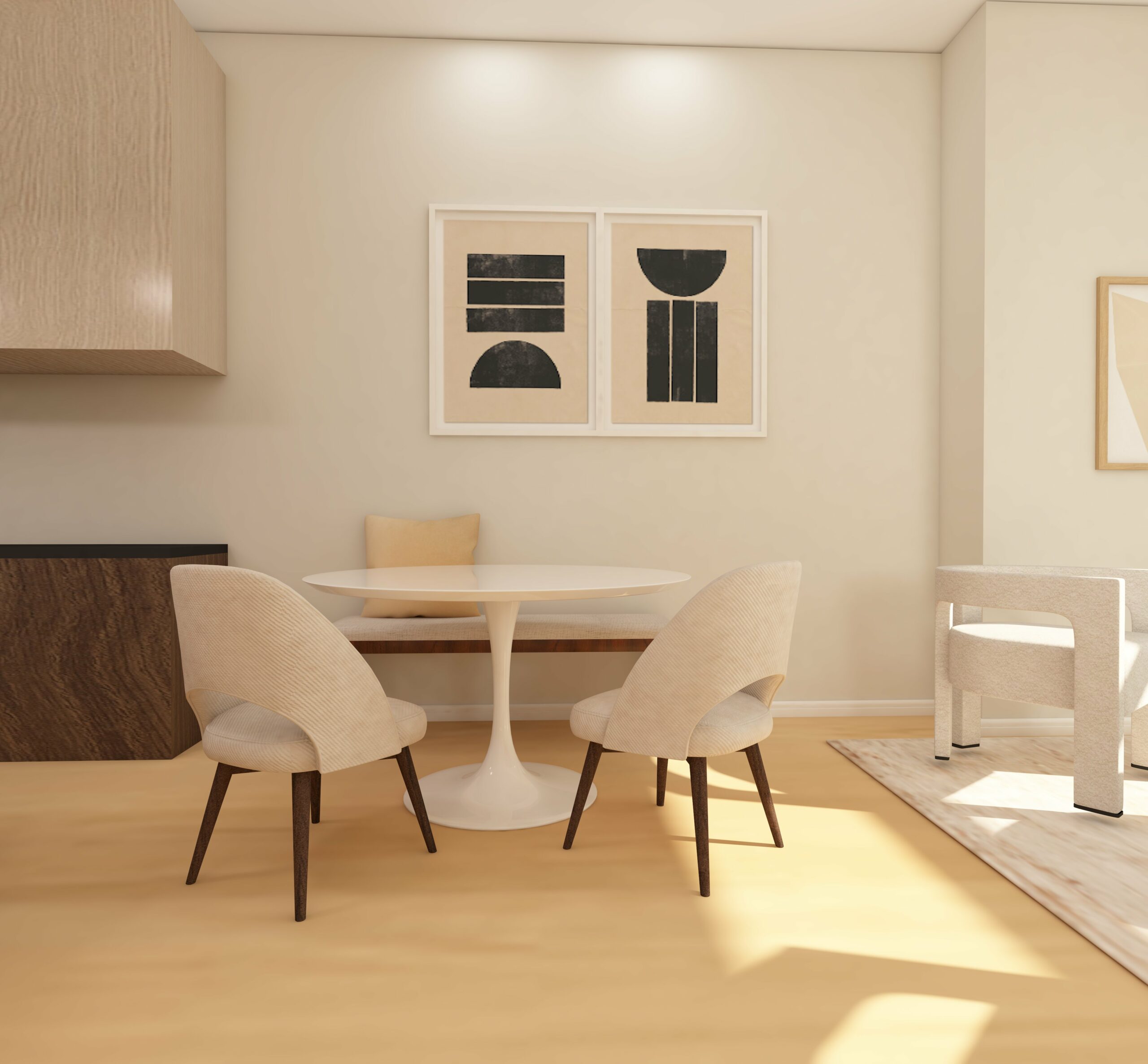
A neutral palette is not a lack of decision, it is the decision that lets everything else in the room speak. White creates the cleanest, most spacious impression and bounces light well, which matters enormously in older Riviera apartments where rooms tend to be smaller and darker than newer builds.
Undertones are the detail most people skip and later regret. A warm white with yellow or pink undertones sits naturally against wood furniture and terracotta floors, both common in this region, while a cooler white with blue or grey undertones suits a more minimalist, contemporary interior. Greige, that hybrid of grey and beige, has become popular precisely because it dodges the question and works with almost anything.
Where a splash of colour earns its place
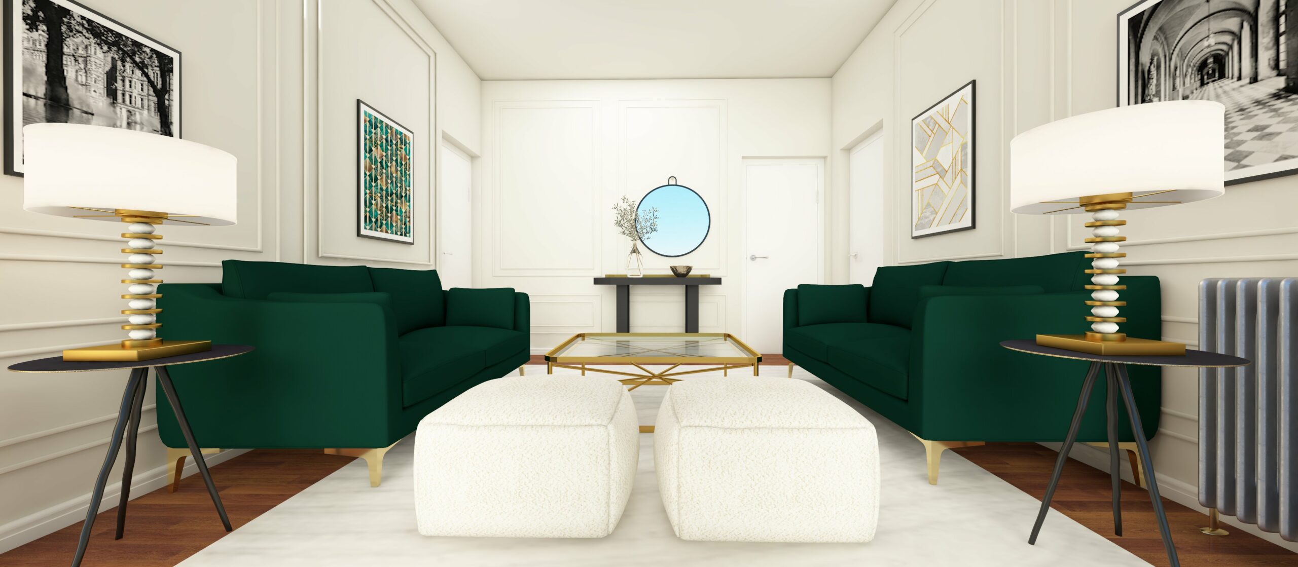
Once the neutral base is set, an accent colour or two gives a room personality without alienating buyers who do not share your taste. Blue, in soft shades like sky or powder blue, tends to calm a bedroom or bathroom, while a deeper navy can bring real presence to an entryway or dining room, especially fitting so close to the sea.
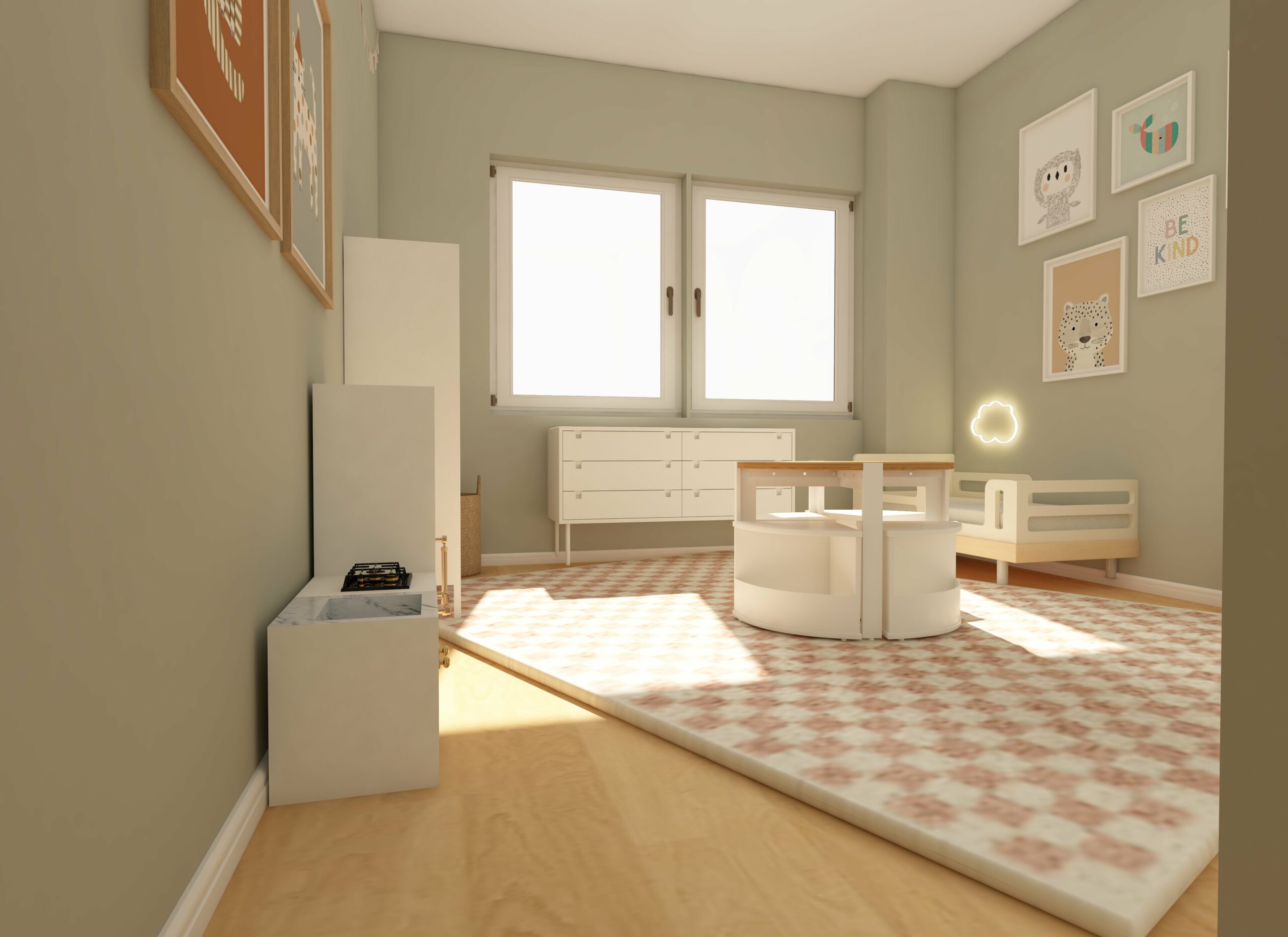
Earthy greens, sage or olive rather than anything bright, do something similar in living rooms: they nod to the outdoors without demanding attention. Warm yellows and soft terracotta oranges work well in kitchens, where they tend to feel inviting rather than aggressive, but we would be cautious with anything too saturated, since a shade that feels lively to you can read as overwhelming to a buyer standing in the room for the first time.
Making the colours flow from room to room
The biggest mistake we see, and the one we made ourselves early on, is treating each room as its own separate project. Repeating a colour thread, a grey living room paired with a soft blue or green in the adjoining dining room, gives the whole home a coherent feel rather than a patchwork one.
Balancing warm and cool tones matters just as much. Too much warmth can make a small apartment feel cramped, while an all-cool palette can leave it feeling clinical. Mixing the two, deliberately rather than by accident, tends to land somewhere buyers respond to.
Why lighting changes everything about a colour choice
We learned this one the hard way: a grey we loved in the paint shop looked almost blue in our north-facing hallway and nearly green under the kitchen’s old fluorescent tube. Natural light makes colours look brighter and truer, while artificial light, depending on its temperature, can shift a colour noticeably. A room that gets little direct sun generally benefits from a warmer paint choice, while a sun-drenched south-facing room can carry a cooler shade without feeling cold.
Layering light sources, a floor lamp here, a wall sconce there, alongside dimmer switches on the main fixtures, does more to make a room feel welcoming than almost any other single change we have made.
Colour choices at a glance
| Room | Recommended base | Possible accent |
|---|---|---|
| Living room | Soft grey or greige | Sage green or navy |
| Bedroom | Warm off-white | Sky or powder blue |
| Kitchen / dining | Clean white | Soft terracotta or ochre |
| Bathroom | Cool-toned white | Pale blue |
Testing a colour before you commit to a whole room
We used to trust the little paint chip from the shop, and we were wrong to. A colour on a two-inch card under shop lighting almost never matches how it behaves across a full wall in your own home. Now we paint a sample patch, at least a metre square, on two different walls of the same room: one that gets direct sun and one that does not, and we look at it in the morning, at midday and again in the evening before deciding anything.
This matters more on the Riviera than in a lot of other regions, because the quality of light here changes so much through the day. A shade that looks perfectly balanced at noon under the Mediterranean sun can turn cold and flat once the light softens in the evening, which is exactly the moment many viewings happen after work.
Regional touches that read as intentional, not generic
A few accents that nod to where you are tend to land well with buyers here without tipping into anything overdone. A pale terracotta or sand tone in an entryway, echoing the region’s traditional render, reads as a considered choice rather than a builder’s default white. Likewise, a muted sea blue used sparingly in a single room, rather than splashed across the whole apartment, can suggest the coastline without turning the home into a theme.
The point is restraint. One regional touch, done well, says more than five scattered ones that fight each other for attention.
Does staging colour actually change the sale price?
We could not find a France-specific figure worth quoting here, so we will say that plainly rather than borrow a number from elsewhere and pass it off as local. What does exist is US data: the Real Estate Staging Association’s Q1 2025 report found professionally staged homes returning an average of $23.34 for every dollar spent on staging, and close to half of sellers’ agents reporting shorter time on market for staged homes. Colour choice alone will not move a sale price the way full staging can, but it is the cheapest lever in that toolkit by a wide margin.
A couple of things people ask us
Should I repaint every room before selling? Not necessarily. Focus first on the rooms buyers linger in and judge hardest: the living room, the kitchen, and the main bedroom.
What if I cannot agree with a partner on which colour to use? Lean toward whichever option is more neutral. Home staging is not the moment to settle a personal decorating debate.
We are not interior design professionals, just a couple who has repainted a rental studio more times than we would like to admit, so for a full staging plan or a tricky colour decision, a local home stager will see things in your rooms that photos on a screen never will. Once the walls are sorted, the rest of the staging checklist matters just as much, which we cover in our piece on common home staging mistakes, and if you are staging specifically to raise the sale price rather than just to sell faster, our guide to boosting a property’s value goes further into that.
Published 16 August 2023. Last updated 29 July 2026.
Sources: Real Estate Staging Association Q1 2025 report, via HomeStagingNewswire.com (2025).